If you’re running a convenience store or are thinking of doing so, it’s important to note that convenience stores don’t necessarily play by the same rules that apply to supermarkets and grocers.
This is particularly true when it comes to merchandising and point-of-sale material (POSM) displays. It’s all about one thing: convenience. The quick ease of getting what they want or need is the value that customers pay for, despite the generally higher prices of items.
How does one go about setting up the POSM displays in a convenience store? Here are some tips to get started well.
1. Maximize space efficiency
Unless it’s a superstore, the common convenience store isn’t typically spacious. When space is not properly utilized, it becomes an inconvenience for customers, particularly when stacked boxes of unshelved goods block other items and obstruct aisle walkways.
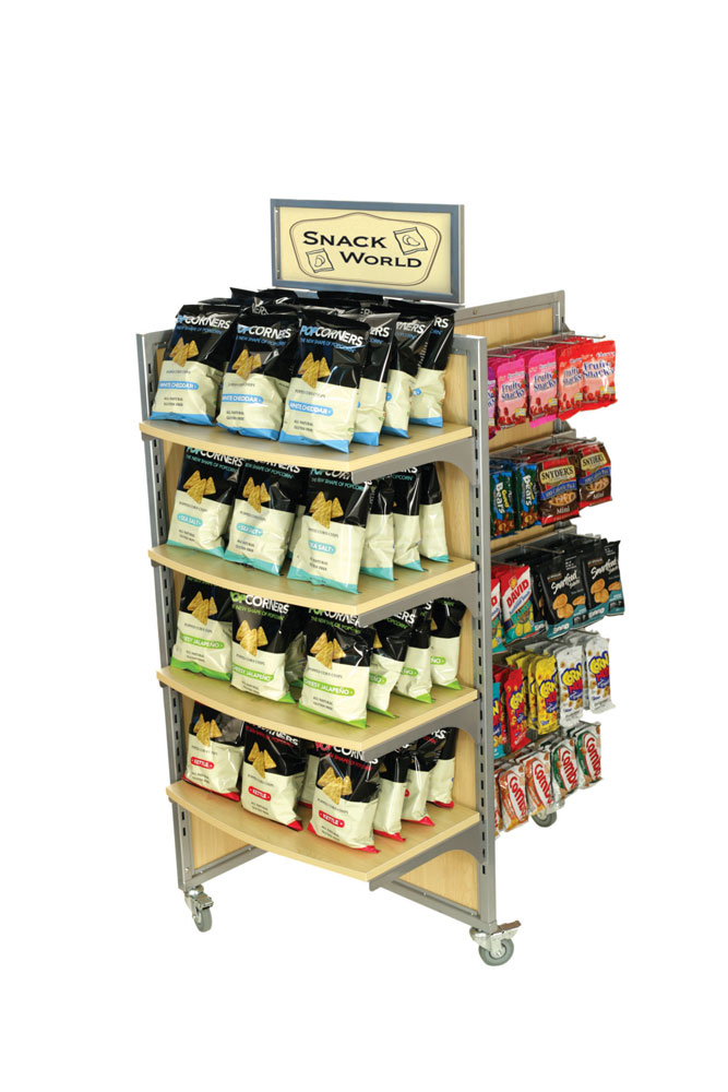
As such, convenience stores that are true to their name would use POSM displays that maximize how much access customers have to products while taking up as little space as possible.
4-sided pinwheel display that allows for easy access from all sides (Source: Rich Limited)
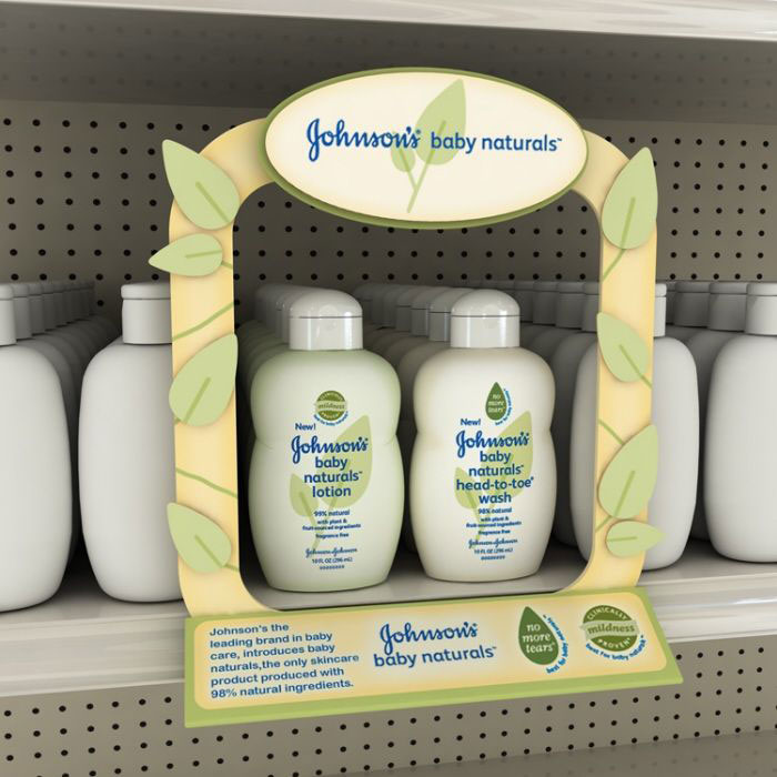
As for spotlighting new or promotional items, shelf talkers are a great way to save space while catching attention. Customers at convenience store aisles would likely browse for goods close enough for shelf talkers to make a difference compared to supermarkets or larger grocers.
Decorative shelf talker (Source: Pinterest)
2. Create visually clearer and neater sections
If you’ve ever rushed into a convenience store just to grab an item or two and head back out within a minute, chances are you would want to be able to easily find those items.
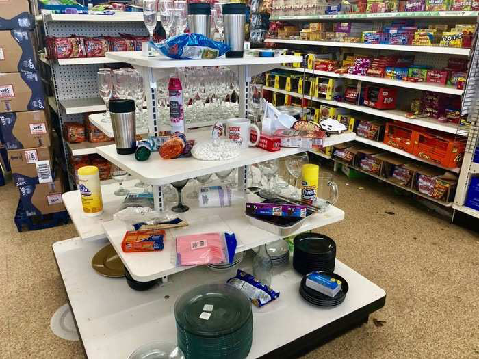
If aisle walkways are cramped and your eyes aren’t able to make sense of what you’re seeing in the store, what are the chances that you’re keen to drop by that place again? Spaces that are organized and easy to navigate would be a plus point for any establishment, but even more so for convenience stores.
Recently looted, or just disorganized? (Source: Business Insider)
The one aspect that convenience stores need to get right is clear demarcation of sections. If customers can tell apart the different sections from just a few glances, then the store is actually providing them with convenience.
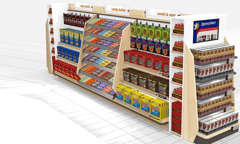
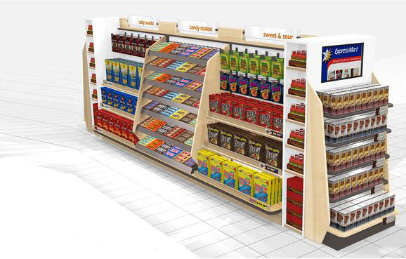
But it’s not always as simple as that. Some sections would need to be divided into subsections; for example, a gondola fixture display for snacks wouldn’t serve customers well to have chocolates, sweets, chips, and nuts all mixed up. Furthermore, each subsection would require organization for its assortment of premium (and typically pricier) brands, affordable ones, and everything in between.
What an organized gondola display would look like (Source: Rich Limited)
3. Focus on quicker, easier navigation for items
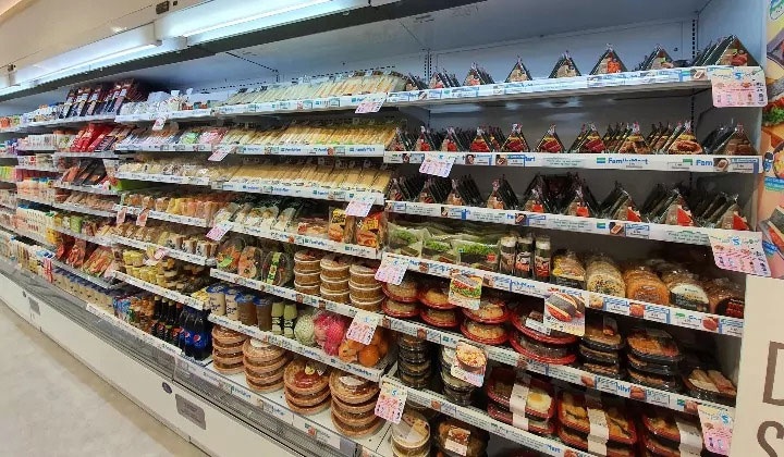
There are also instances where creating clearly organized sections may not suffice. Chilled and frozen goods subsections, for instance, are harder to demarcate so they can use informational shelf talkers for ease of reference instead.
This is due to the fact that some food items aren’t packaged like dry food. It’s easy to tell apart the packaging of regular and Matcha Kit Kat, but variations of onigiri (rice ball snacks) are virtually impossible to tell apart unless there are product tags to do so.
Shelf talkers as informational product tags (Source: The Rakyat Post)
4. Consider other conveniences
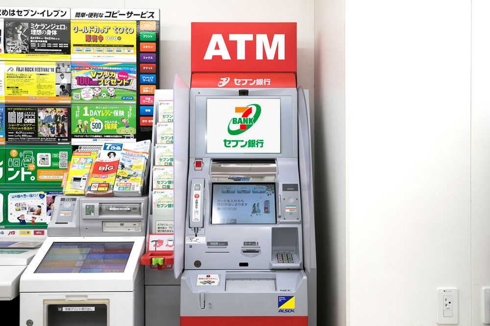
It’s easy to think of convenience stores as downsized supermarkets, but that doesn’t quite hit when we consider how Japan does it. Japanese konbini stores take a more holistic approach to the idea of convenience by offering all types of conveniences – from bill payments to printing services to currency exchange, free Wi-Fi, ticket reservations, and full meals.
Customers are probably used to getting the odd hot snack or two from convenience stores, some ice for a party, or perhaps a few ATMs and toll card top-up services. But there’s a lot more that could be added in for extra convenience. Photocopying services? Free Wi-Fi? Freshly cooked breakfast and dinner meals?
Convenience goes beyond just ATMs in Japan’s 7-Eleven stores (Source: Nippon.com)
5. Consider ‘fresh’ goods
Speaking of meals, convenience stores like Family Mart have done a marvelous job of turning up the heat on fast food brands. Forget Drive-Thru meals, how about a hot and sizzling oden (Japanese stew) or crispy chicken fresh out of the oven for dinner?
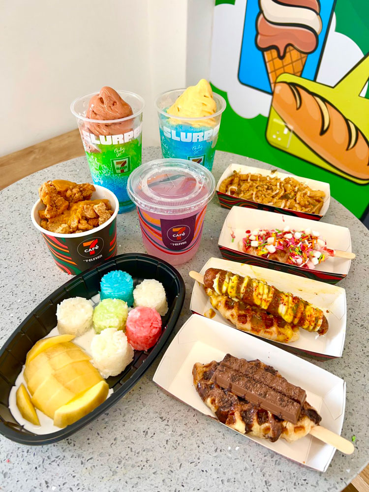
7-Eleven, for one, had made waves in the past with the Slurpee, and has recently decided to expand into 7-Cafe to meet the growing demand for grab-and-go meals. While smaller local convenience stores may not have the same scale and reach, they could still put their own unique spin to meet the demand for fresh foods in their own neighborhoods.
7-Cafe offers a variety of food options (Source: KL Foodie)
How does this relate to POSM displays? The brilliance of promoting both added services and fresh foods as POSM is that they act as a pull for customers. Someone coming in to photocopy a document may end up buying snacks on the way out. Someone tempted by the delicious meals displayed at the store entrance would end up buying a drink to go along with his/her meal.
6. Selling convenience
Level of convenience is the main difference between grocery shopping and popping in and out of a convenience store to grab something. While there are many major overlaps on how retailers would employ POSM displays in both scenarios, notable differences exist too, such as the availability of space and the sort of products customers have in mind to buy from each setting.
What do you usually look for in a convenience store?

