How shoppers spend is determined by how they feel. One of the main influences on their mood is lighting. How a retail setting is illuminated affects how they perceive the products they see, and that in turn affects how they shop.
Brands in supermarket settings often don’t have a say over any given store’s lighting choices. But that’s where point-of-sale material (POSM) displays come in.
How can brands make the most of various lighting effects to create strong impressions through POSM displays?
Creating a luscious and sensual appeal
Liquor brands tend to lean on the side of classy when it comes to promoting their products. If not, then at least a sense of mystique that befits the nightclub scene.
To achieve such an effect, higher temperature lighting colors are diffused through translucent liquor bottles, creating a golden glow. As a tabletop display, it looks beautiful in dark rooms.
Source: Hometalk
Made to stand out in a dark/mundane environment
Sometimes a display needs to stand out in dark places without the golden mystique. It can be brightly lit without an overbearing glare, such as the Heineken advertisement board below. Although it isn’t strictly a POSM display, it still acts as one given that it’s from a bar.
Source: UK POS
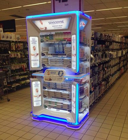
On the other hand, a visually noisy retail environment such as a supermarket may need brands to turn up the brightness. This means POSM displays that are brighter than their surroundings, including the lights that hang overhead.
The following Sensodyne display is eye-catching for its brightness and adds a bit more character with neon blue accent lights.
Source: Pinterest
Designed to capture a specific aesthetic appeal
Brands can do more with lighting than to win the eye of shoppers. The right lighting against the right backdrop can help to draw out brand personality in compelling ways.
Source: Retail Design Blog
Take for instance the adidas Originals BASECAMP 107 campaign in Seoul, Korea. Set within a container-style warehouse site called URBANTAINER, adidas displays its shoes on stands lit by green accent lighting that anchors the entire neon grunge aesthetic of the space.
Bold but not overbearing
In some instances, it’s smarter for brands to implement lighting in less intrusive ways. The goal is no doubt to still catch the eye of shoppers, but to do so without disrupting the ambience of a setting.
Source: ADDLUX
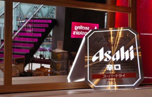
Asahi’s illuminated display in Itsu sushi restaurants is a good example of how to be attention-grabbing but not overbearing. Nevertheless, it does a decent job to encourage purchase consideration from diners.
Bright for a positive and invigorating atmosphere
Bright white lights feel energizing. So instead of illuminating specific areas of a store as focal points, some brands brighten their entire store while doing so carefully to avoid blinding shoppers.
Source: UK POS
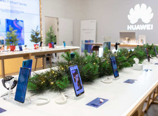
Tech and electronic stores do this well. There are no direct lights, but somehow the store feels more invigorating than the space outside.
Huawei’s application of this approach (pictured above) adds a bit of festive flavour through tasteful Christmas decor and fairy lights.
Let there be light!
It’s clear that choice of lighting can truly make a POSM display stand out and become unmissable to their target shoppers.
To get it right, brands need to ask some important questions: How do they want to make the shoppers feel? Is the style of lighting consistent with who the brand is? How does a choice of lighting fit within the larger context of the setting the display is in?
Done well, savvy illumination for POSM displays make shopping experiences more enjoyable and helps brands to reach their goals as well.


