For big brands, it may seem that global brand recognition means they no longer need to put a lot of effort into standing out at supermarket aisles. These brands come immediately to mind when mentioning a particular product category. Chocolate? Cadbury. Energy drink? Red bull. And so on.
However, big brands cannot be complacent; they need to keep running in order to remain relevant, and prevent from becoming obsolete in an ever-changing market. One of the ways newer brands can learn from them is to learn how they create their point-of-sale material (POSM) displays.
That’s because good POSM displays translate to sustained retail sales performance. To be able to grow, brands first need to grow their sales.
Here are two common POSM design strategies from big brands that could help smaller and newer brands on their way up:
1. Leverage signature product design
What makes some products instantly recognizable is their packaging design. Making use of a signature look to attract eyeballs helps big brands get the attention they want quickly.
Check out how the likes of Hennessy, Red Bull, and Jameson do this:
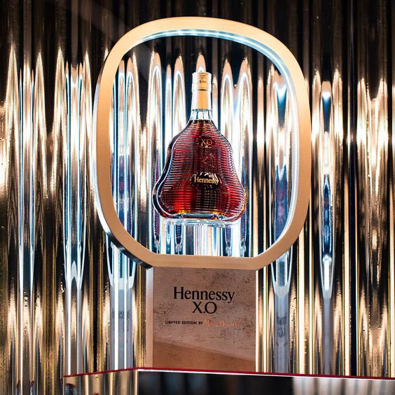
Hennessy
Although the renowned VSOP cognac brand offers other designs, it has one that stands out for its graceful curves.
The best way to promote it is to let the bottle stand on its own in a glorifier as a tabletop display, which emphasizes the product as-is and pushes attention to it as the visual focal point.
Source: Pinterest
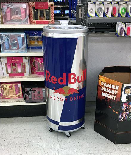
Red Bull
The shape of a Red Bull can is nothing to shout about, but its silver-blue chequers make for easy recognition and a bold statement. A giant Red Bull reimagined as a unique cooler in the supermarket? That’s a win!
Red Bull cooler (Source: Fixtures Close Up)
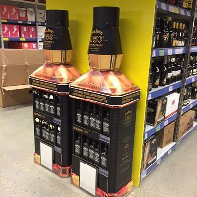
Jack Daniel’s
Giant bottle-design POSM displays don’t always have to be free-standing displays, especially when they fit gondola end display sections like a glove.
Jack Daniel’s takes advantage of its boxy bottle design to make an eye-catching gondola end display that doesn’t look out of place in an otherwise sterile supermarket setting.
Jack Daniel’s end cap display (Source: Pinterest)
2. Leverage memorable branding elements
Apart from packaging design, some brands are well-known for certain elements they consistently employ in their branding. Effective use of these elements activates brand recall for shoppers in a snap.
Here’s how Oreo, Kit Kat and M&M’s do it:
Kit Kat
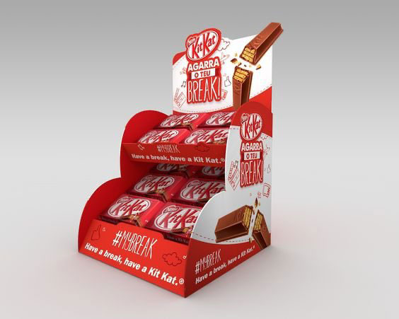
One glance at a KitKat bar and you know there’s no other like it. But it’s the slogan of the brand that distinguishes it from others. It’s all about having a break, signified by the break of the chocolate wafer bar.
The magic of KitKat’s constant use of the slogan is that you don’t need visuals of the wafer bar for instant recognition.
KitKat counter top display with iconic slogan (Source: Pinterest)
Oreo
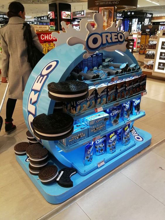
‘Twist, lick, dunk’ was the slogan famously associated with Oreo, though it hasn’t had the longevity of KitKat’s ‘Have a break, have a KitKat’.
Hence the brand doubles down on the use of visual elements for Oreo: the familiar sandwich cookie itself plus elements of milk or milkiness.
Oreo standee (Source: Pinterest)
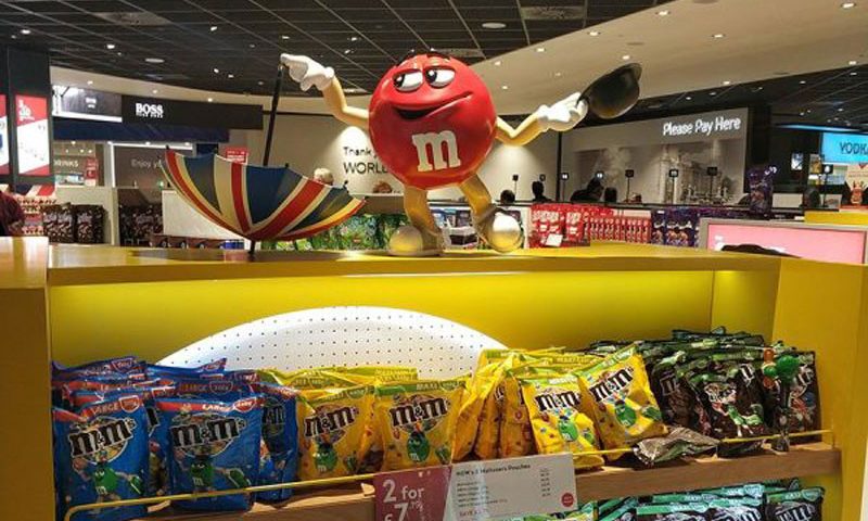
M&M’s
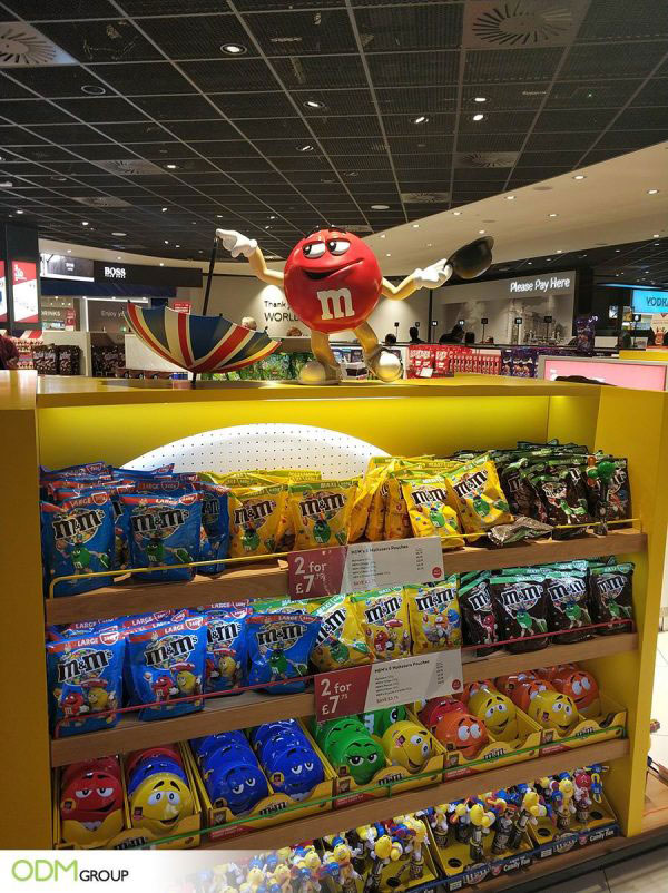
KitKat is red, Oreo is blue; M&M’s consist of both plus a lot more colors represented by individual M&M’s mascots.
This lends the brand a great deal of versatility as the mascots can liven up the most mundane displays. With them, any color works, and there’s no need for unique standee designs or special block displays.
M&M’s red mascot on a display shelf (Source: ODM Group)
Learn from the industry leaders
When it comes to POSM displays, the goal is simple: to prompt shoppers to decide on purchasing the items on display.
Shoppers typically trust big brands and would prefer them over lesser known competitors. This is because they continue to execute their lower funnel (sales level) marketing effectively.
The good news is that smaller brands can find the aspects that make their brand attractive and leverage those to win sales at stores and supermarkets. Whether it’s a sticky slogan or a memorable product design, by showing up in the right ways to shoppers they’d be able to gradually compete alongside the big players in their industry.

