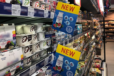
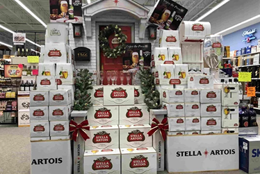
Shopping is no longer the same as it was before. Retailers are faced with the challenge of constantly innovating and keeping up with shoppers’ changing needs.
What can you do to stand out? If you’re feeling like your POSM (point-of-sale materials) could use an upgrade, you need creative and inspirational ideas that will help shoppers experience your brand in new ways.
These ideas are not strictly banners, wobblers or conventional in-store materials but they offer some very useful lessons for your POSM design that can improve customer interaction and experience while also encouraging them to come check out a business again soon.
1. Use inclusive design for POSM that appeals to a wider audience
The key concept here is inclusive design, which is design that takes into account those with special needs.
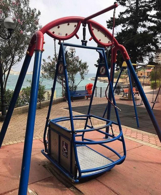
About 15% of the global population live with some sort of disability, with approximately 80% of them in developing countries. The swing (pictured below) at a park for those in wheelchairs proves that fun and interactive design is also possible for them. How could brands design their POSM to be accessible to those who can’t reach the higher shelves in regular supermarket aisles? Robotics? Ingenuity of layout? Grabbing sticks? It’s an opportunity to innovate!
Source: Social Junkie (Facebook)
Sometimes inclusive design could be a matter of mental health too. Retail settings can often be overwhelming to the senses. Locally, Sunway Putra Mall redesigned its space to be an autism friendly mall, equipped with Calm Rooms for those with autism who need a break from the noise.
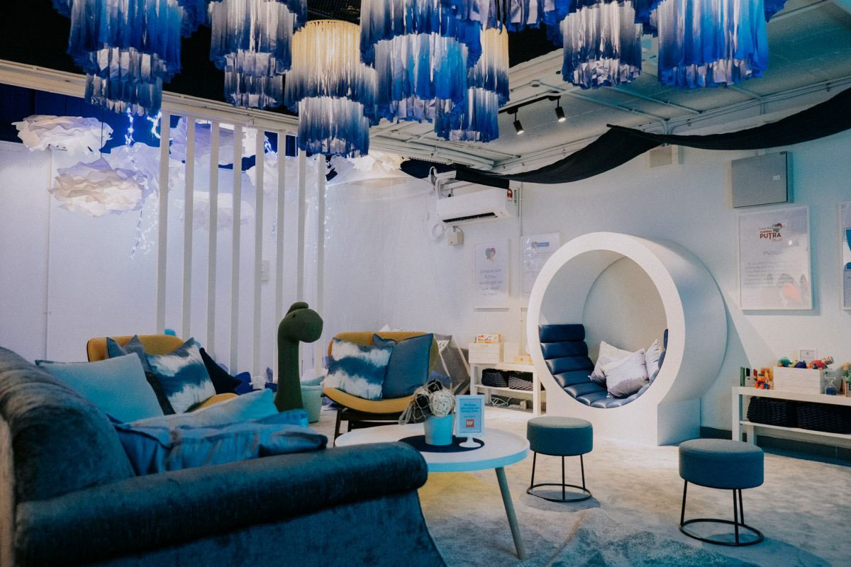
Source: Sunway Putra Mall
When brands design to be inclusive, they are not alienating or missing out on normal customers. In fact, they are building a better name for themselves by showcasing strong values, which is especially important among younger shoppers. And it’s a challenge that brands need to take their POSM efforts to the next level.
2. POSM that starts before shoppers enter your front doors
In malls and supermarket settings, we see POSM in the form of floor stickers, stickers lining the side of escalators, posters and buntings. But parking lots are often left humid, grey and bland. Why not apply some of the principles of guerilla marketing to raise some eyebrows before shoppers come into the brightly lit space of retail?
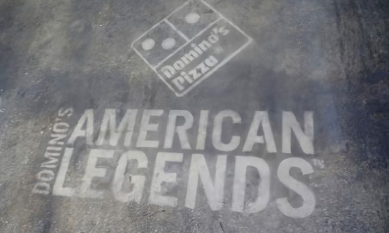
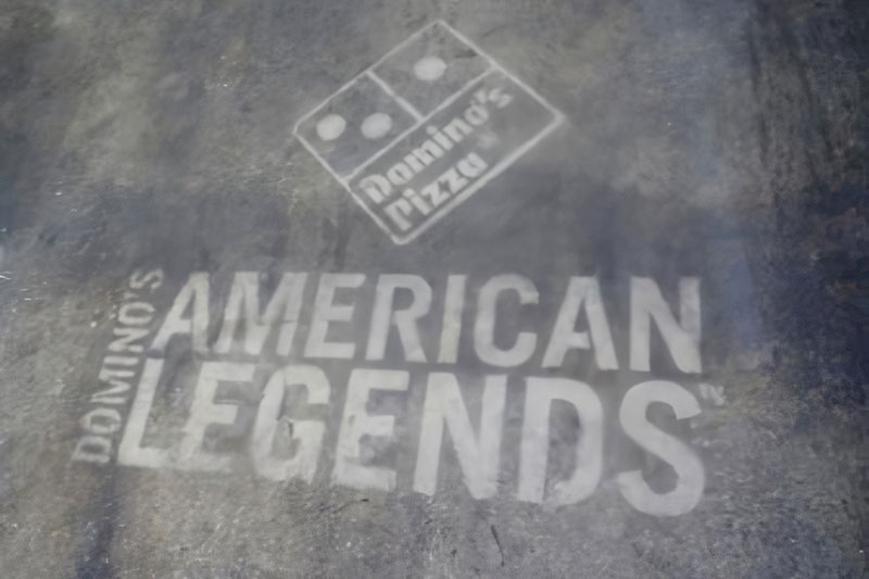
Consider how Domino’s Pizza uses spray paint in place of floor stickers. It’s not something that you can really get away with in-store.
Source: Wordstream
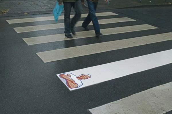
Or consider how Mr. Clean illustrates its product by merely using a zebra crossing. You could easily do that in a parking lot.
Source: Wordstream
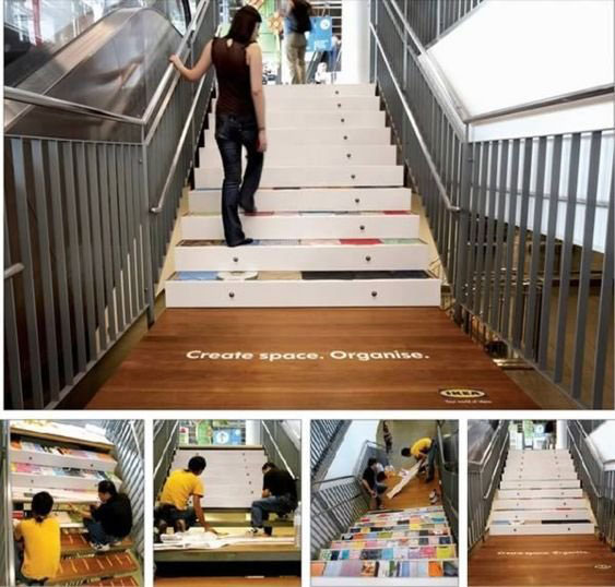
Past the parking lot and on the way to the store, IKEA illustrated a brilliant way to make use of their staircase to promote their space-saving drawers. Paired with snappy copywriting, it makes for a powerful impression.
Source: Pinterest
What objects or fixtures do people interact with that could be leveraged as POSM? Door handles? Toilet stalls? Floor spaces? Tables and chairs? How can you leverage them tastefully and to great effect?
3. POSM design that makes shopping easier and more interesting
POSM that grabs attention with a strong and clear message to spur impulse purchase or at least purchase consideration does its job well. Brands, however, can take it even further with POSM that adds value to the shopping experience.
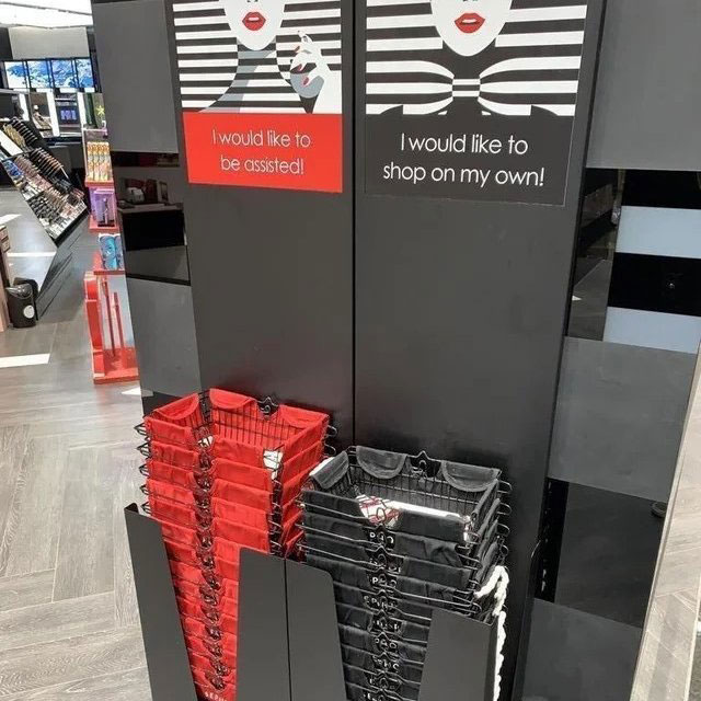
Sephora understood the hassle shoppers felt of always being attended to by in-store staff. So what the personal care retailer did was introduce two types of baskets: one for shoppers who wanted help from staff and those who wanted to be left alone.
Source: Cami Williams (Twitter)
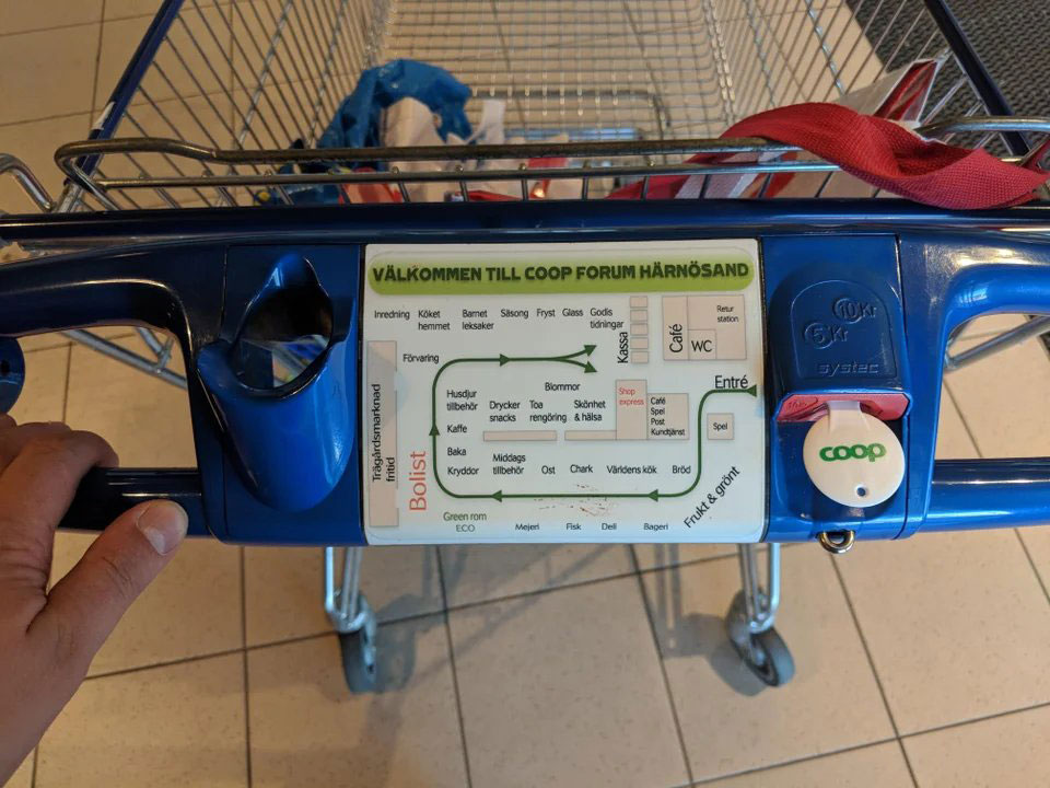
Supermarkets in Sweden use trolleys equipped with a map of their store. It doesn’t really cost them much to do so and makes the lives of shoppers so much easier, all without getting in their face with promotions.
Source: Reddit
With such examples in mind, how could retailers and brands use this principle of adding value to the shopping experience in the design of their POSM? Perhaps a live digital map or interactive directory on trolleys? The use of such tech could still serve as POSM to include their promotions. For food or organic produce sections, perhaps interactive displays for product FAQs? QR codes to scan for digital coupons? Again, it’s all a matter of creativity.
Be different + Add value = Stand out in retail
We hope the ideas above give you new inspiration for how you might be able to design effective in-store promotions that speak directly with customers in ways they’ve never before expected.
What’s been the most successful way for you as a retailer to get more people through the door? Let us know if any of these strategies have worked well for your company!

