One of the most important factors in determining the success or failure of a brand is the effectiveness of its point-of-sale materials (POSM), also known as point-of-purchase (POP) displays.
This includes any marketing materials that are used to promote products at retail locations, such as grocery stores, convenience stores and gas stations.
Sometimes making amazing and attention-grabbing POSM designs for your brand means getting creative ideas from other brands that have been gaining more customers through smart design.
Good designs do more than just catch attention, they are also difficult to miss and are able to hold shoppers’ attention for long enough to get the message across clearly.
Because of the flexibility offered by supermarket spaces, in this article we’re looking at 8 awesome designs that we absolutely love from supermarkets.
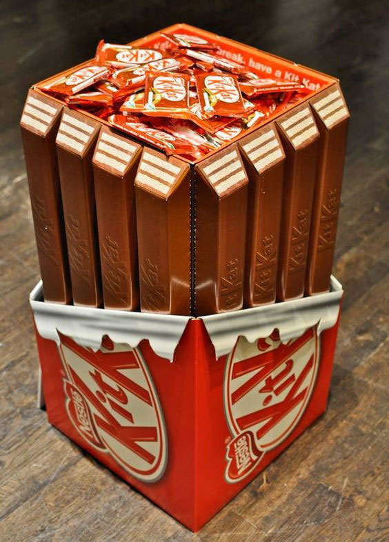
1. Treasure trove of KitKat
Source: Pinterest
KitKat bars are iconic and don’t look like any other type of chocolate bars. This leads to some pretty creative ideas for their POSM displays. In any supermarket setting, you’d be able to recognize this display from any distance. Because KitKat works as a small on-the-go impulse purchase, this design doesn’t always have to take up floor space as a dump bin; it could work on a smaller scale as well, perhaps as a tabletop POSM display.
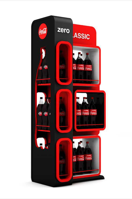
2. Coke Zero vs Classic: Bold branding
Source: Pinterest
No gimmicks, just bold colors of the brand. That’s all it takes for this Coke standee to stand out, especially when promoting its Zero variant. By displaying Coke Zero alone, this display wouldn’t work quite as well. It’s the contrast that sells it.
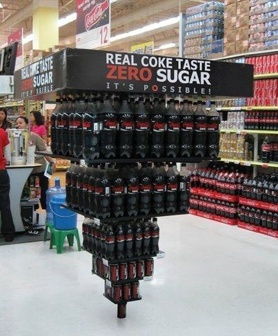
3. Coke Zero: It’s possible!
Source: Pinterest
Is it going to fall? There’s an immediate tension when looking at this Coke Zero block display. With a smart visual trick and clear copywriting, it gets the point across well enough: it’s really possible to enjoy full Coke flavors without the sugar. Because of its “anti-gravity” design, it’s a unique take on hanging displays (yes, this was actually hanging from the ceiling).
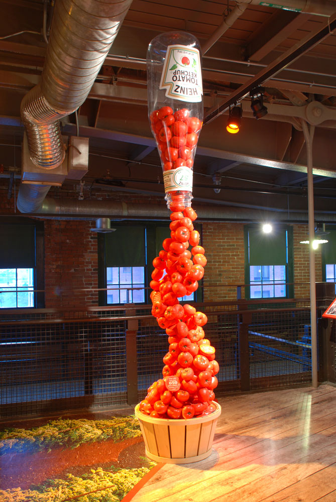
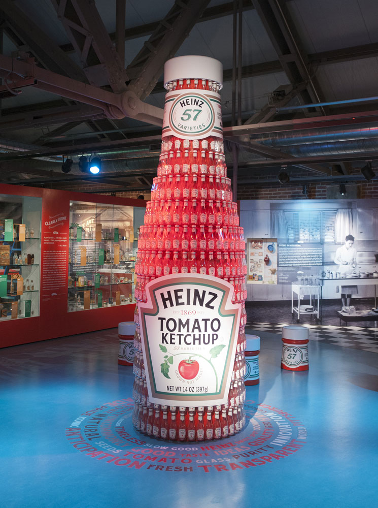
4. Heinz: Standing tall
Source: Heinz
Although this Heinz exhibit wasn’t shown in a supermarket, it’s easy to see how it would distinguish itself among grocery shoppers. Creating the monumental block displays by stacking ketchup bottles seems easy enough. Doing so to create the tomato waterfall (right) would be another feat altogether.
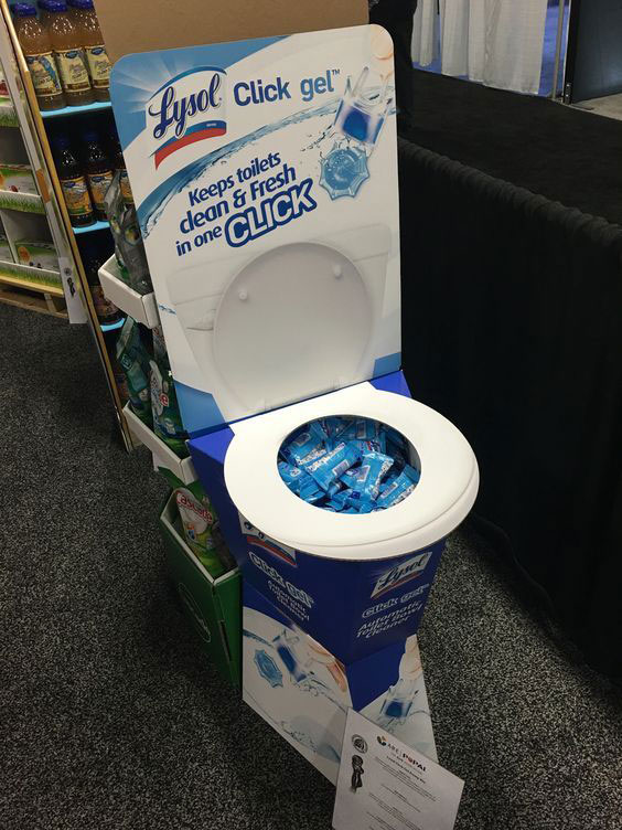
5. Lysol Click Gel: Click to clean toilet bowl? 🤔
Source: Pinterest
Lysol Click Gel lets people conveniently clean their toilet bowls by simply “clicking” the cleaning gel onto the inner sides of the bowl. But isn’t click associated with software? Lysol used the right sort of display to help make sense of what the product is for, and create intrigue around the ingenuity of its design.
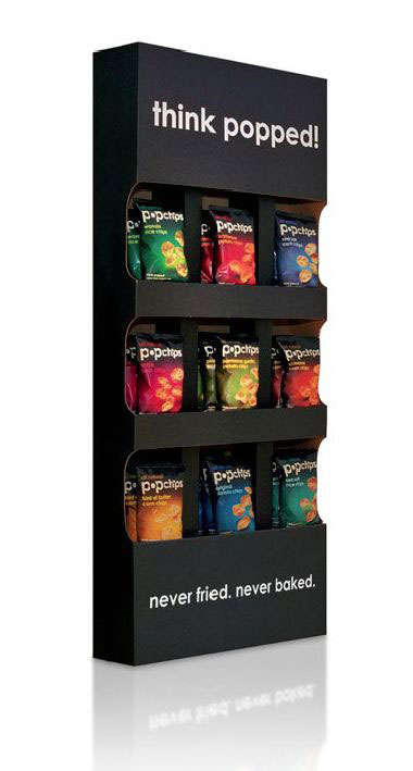
6. Popchips: Copy comes first
Source: Pinterest
Sometimes, the best way to stand out amidst other bright, colorful and outrageous POSM displays is to go the other direction, while still being attention-grabbing. Using a simple corrugated standee, Popchips shows that you could do so and emphasize copywriting, to effectively convey their products as healthy.
7. Sell more by knowing customers
Source: Bored Panda
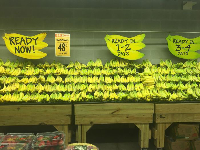
Sometimes you don’t need great visuals to sell. A great POSM works by simply making grocery shopping easier for customers. In this case, bananas ripen and rot very quickly, and that is real bane for shoppers. So it was a brilliant idea for this store to sort bananas out based on when (or how quickly) shoppers want to consume them. This is a great POSM for Malaysia, where because of higher humidity bananas ripen more slowly.
8. How fresh? Fresh from the roof
Source: Bored Panda
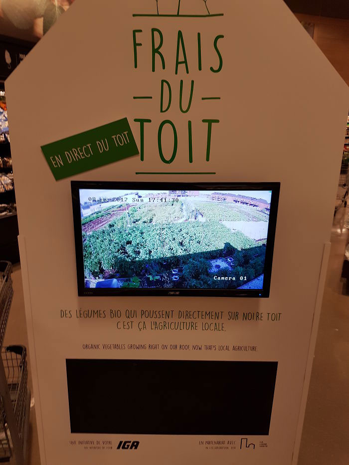
Displays that incorporate digital appeal don’t have to be vibrant and loud to draw shoppers in. IGA Extra Famille Duchemin, a supermarket in Montreal, Canada takes fresh produce to a whole new level by live-streaming their organic vegetables from the rooftop of their building.
Ready to get creative with your displays?
Even if many POSM designs are seasonal and are only shown temporarily, they can leave lasting impressions and serve as inspiration for more creative designs.
Which of the designs in this article caught your eye? Let us know in the comments!


