Point-of-sale materials (POSM) are promotional materials displayed at the places where customers buy products i.e. the points where sales transactions are carried out. Think shop houses, supermarkets, marts or shopping malls.
However, such displays are diverse and don’t all work the same way. So how do new brands and marketers start making sense of them? Here are 6 tips on how to get up and running with POSM displays:
1. Location, location, location
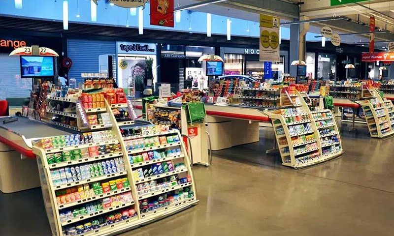
Ever notice how checkout counters are typically lined with little knick-knacks that don’t cost much? That’s because they’re products that don’t require much thought to purchase, making them great for impulse purchases.
According to a CreditCards.com survey, 79 percent of people stated that the majority of their impulse purchases are done in-store.
Since customers are already prepared to splash the cash at checkout counters, it wouldn’t take much for them to throw in one or two of these small purchases and to buy them on impulse.
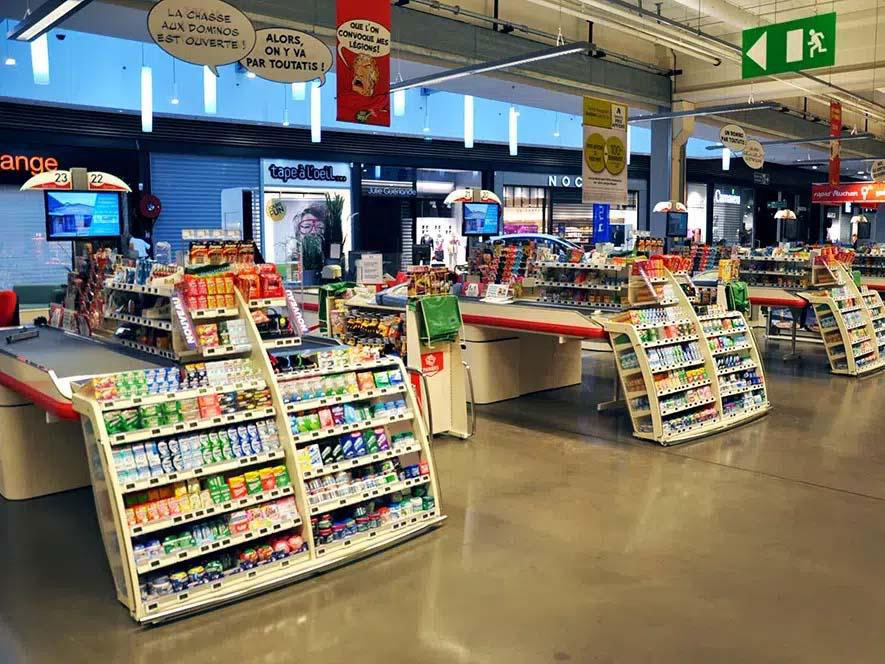
From breath mints to batteries, checkout counters are ripe for impulse purchases (Source: Pilotes)
Similarly, impulse purchases can be encouraged by placing the right goods next to their complementary products. For instance, where is a great place to display batteries? Next to the electronics or toys sections would be a good place to start.
2. Aim for eye level aisle displays
There is a common mantra in retail merchandising: eye level is buy level. Products shelved at the average eye level of a target consumer get more visibility and therefore more sales.
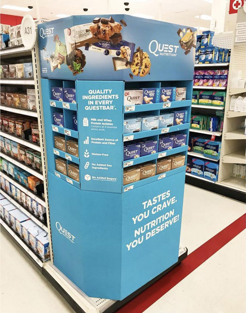
This highly visible gondola end of Quest Nutrition showcases products at eye level while dedicating the rest of its display to visuals and strong copy (Source: Instagram)
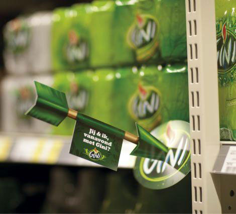
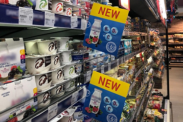
Shelf talkers at eye level can also make an impact (Source: Pinterest)
While having products at eye level is ideal, it’s not always feasible, especially for newer or lesser known brands. It takes a big budget and influence in the industry to get prime positioning on store shelves.
A good POSM display alternative would be to utilize shelf talkers, which are typically placed at eye level too. If a brand’s products are placed at the bottom shelves of an aisle, why not have shelf talkers that point them in the right direction?
3. Focus on one message
A good practice for any brand, big or small, would be to keep things simple. The simpler a POSM display is, the easier it is for consumers to catch what it’s trying to say.
Even if it’s important for all the key selling points of a product to be spelled out, they all have to fall under one clear message. And how a POSM display is represented visually does send a message as well. If the text on a display reads with vibrance and excitement, how it appears in terms of shape and colors have to match.
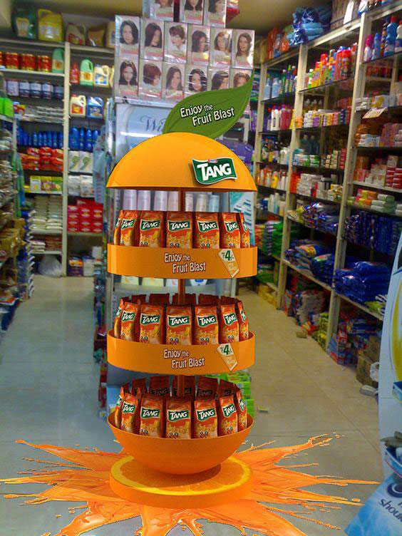
Attention-grabbing free standing display with one clear message (Source: Pinterest)
4. Include a strong call-to-action (CTA)
Call-to-actions (CTA) are powerful when done right. In retail, one great way to get people to take action is to tell them simply what they need to do. Cut the fluff and make it about them: “Get yours today”, “Try now”, “Buy one, get one free” etc.
If a customer is interested in a product, a simple “Buy now” would be enough of a prompt to move them from inaction to action. If they’re curious, a simple “Try now” could get them to pick up a sample or take the product to the fitting room.
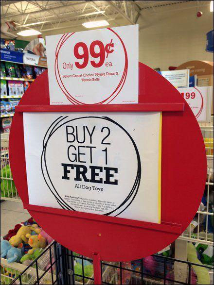
Bold and straightforward CTA signage (Source: Fit Small Business)
5. Have customer service ready
Sometimes POSM displays aren’t enough to persuade those who would sit on the fence until presented with enough convincing info about a product. In these instances, customer service is king, especially if it comes from well-trained floor staff.
This could be from brand store staff or promoters at grocers and supermarkets. While a well-made POSM display may be able to catch the attention of shoppers, it may not have all the answers for those who are interested and extra curious.
6. Leverage on the versatility of QR codes
Alternatively, POSM displays can include QR codes for shoppers to find out more about a brand and its products online. It’s a simple mechanism that can be displayed both digitally and on print. QR codes act as a gateway to help brands build both an online and offline presence, which increases the number of touchpoints they can have with shoppers.
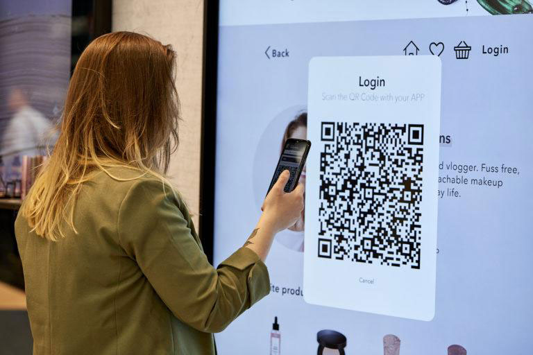
QR codes can be displayed digitally (Source: Retail Insider)
…or on countertop displays, where people already do look for QR codes to make payments (Source: Fit Small Business)
Ultimately, QR codes add a much needed dynamism to any POSM display. Curious about a product, brand or campaign? Scan the QR code to find out more. Want to redeem a voucher for a purchase? Scan the QR code to redeem. Want to sign up for a membership? Scan the QR code and fill up a form online.
How to start strong
Many factors make for good POSM displays. It could be difficult for new brands or marketers to know where to start with the many types of POSM displays.
The good news is that there are a number of tried-and-true tips for beginners and seasoned professionals and vendors alike. While the guidelines above can help new brands and marketers implement POSM displays with more confidence, there’s still plenty more to learn as they go along.

