Sights can often speak louder than words. This is especially so for marketing campaigns that are built on specific themes. To effectively communicate the campaign, point of sale materials (POSM) made with the approach of ‘show, don’t tell’ may prove more useful to shoppers than just good copy.
The good news is that this doesn’t have to be difficult or expensive. If you want to add some visual flair into your POSM for your next marketing campaign, here are a few themes you can start exploring.
1. Idyllic Vacation
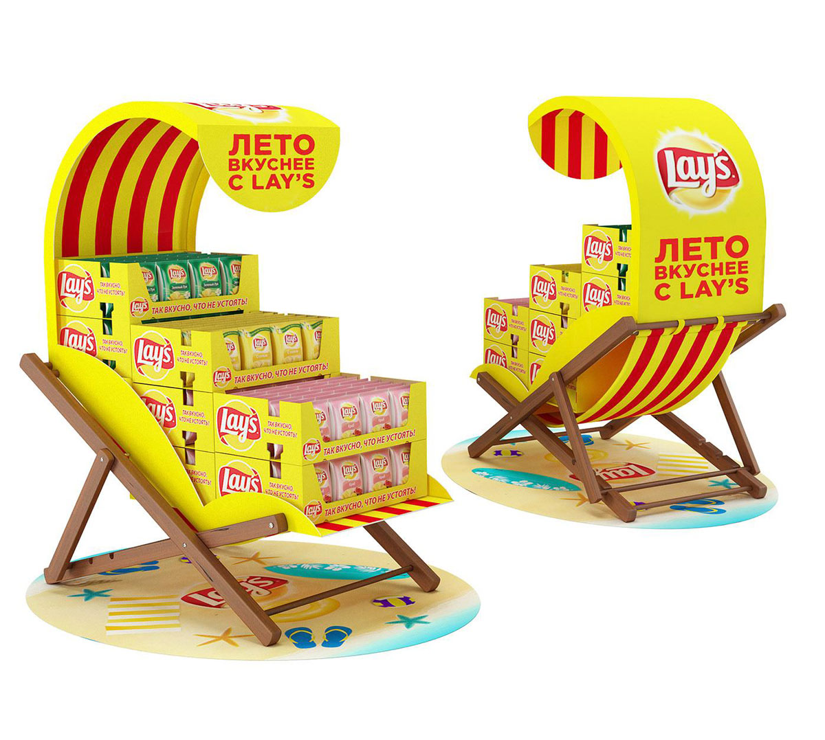
What do you call those chairs that let people lounge by the sunny seaside? Some call it a sunlounger, some call it a tumbona; we call it a smart way to design a POSM pallet display.
This design for Lays chips communicates the idea of having a beachside vacation in an eye-catching and tasteful way.
Lays beach recliner theme (Source: Behance)
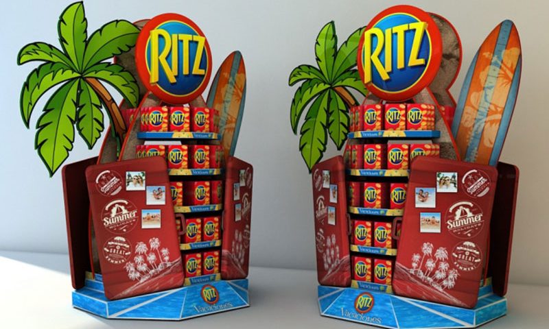
But not everyone pictures a beach vacation the same way. What if we want something that sells the impression of a more adventurous time? Ritz crackers paints a sweet picture of that with its free-standing display.
Ritz crackers surf theme (Source: Pinterest)
2. Fresh From The Farm
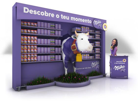
When your brand looks just like Cadbury’s, how do you set yourself apart? Milka, the Swiss counterpart to the famous English chocolate brand, chooses to distinguish itself with the use of cows in its POSM displays.
Not only does this relay the idea that the milk used in Milka chocolate is fresh, but that it comes from specific cows called Gerda, Moocha, Marisa, Katja and Lola – known as the purple cows.
Milka fresh cow milk theme (Source: Pinterest)
Hence the almost life-size cows used throughout its POSM displays represent the actual cows that make Milka possible, and has allowed the brand to set itself apart and be memorable to shoppers in its own unique way.
What’s funny is that both Milka and Cadbury are both owned by Mondelez, so their visual similarities aren’t necessarily a result of one company ripping off the other.
3. Au Naturale
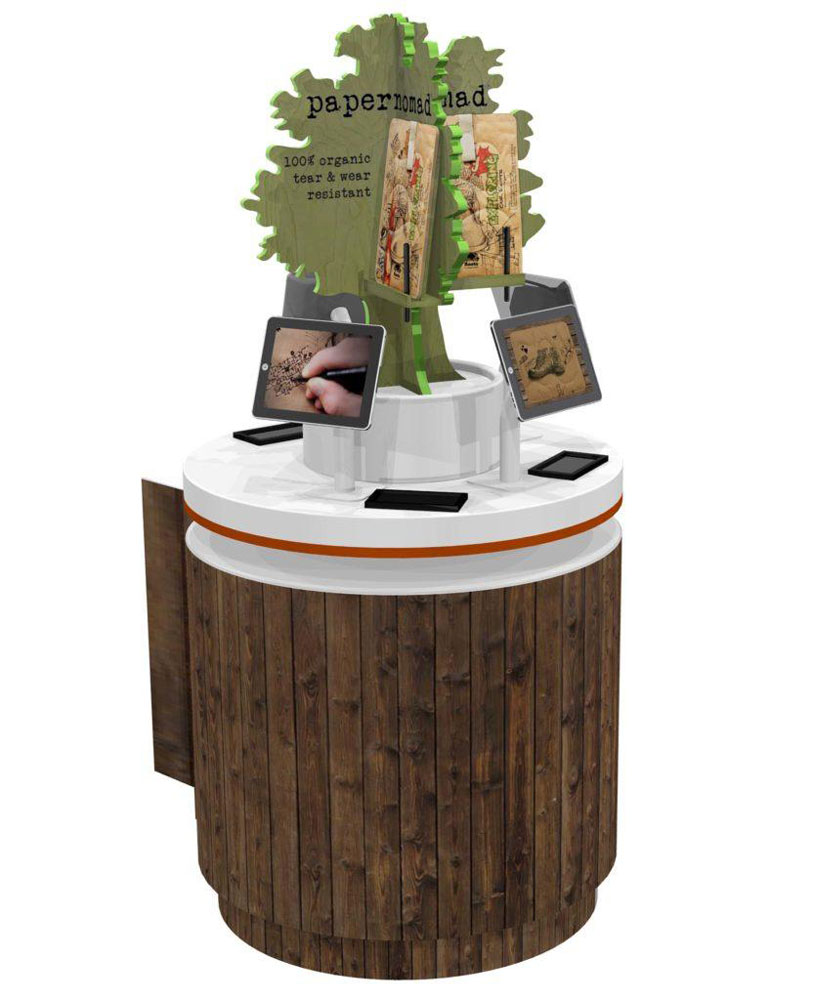
There are many ways to display tech products that involve sleek, clean and minimal designs. But how does a company that sells a tactile, paper-like, water-resistant and fully organic iPad sleeve properly represent its product?
Tactile & organic theme by Papernomad (Source: Rich Limited)
Papernomad proves that sometimes being tech-forward could also mean dialing on analog features. Its POSM glorifier display marries an all-natural look with elements commonly used to feature personal tech products in a way that compromises neither aspect of the product.
Shoppers can actually write on the sample sleeves on display not unlike how stationery brands provide shoppers with sample paper to test their pens.
4. Back To School
Even products that don’t relate directly with going back to school e.g. stationery, bags, school uniform etc. can incorporate a ‘back to school’ theme in their POSM.
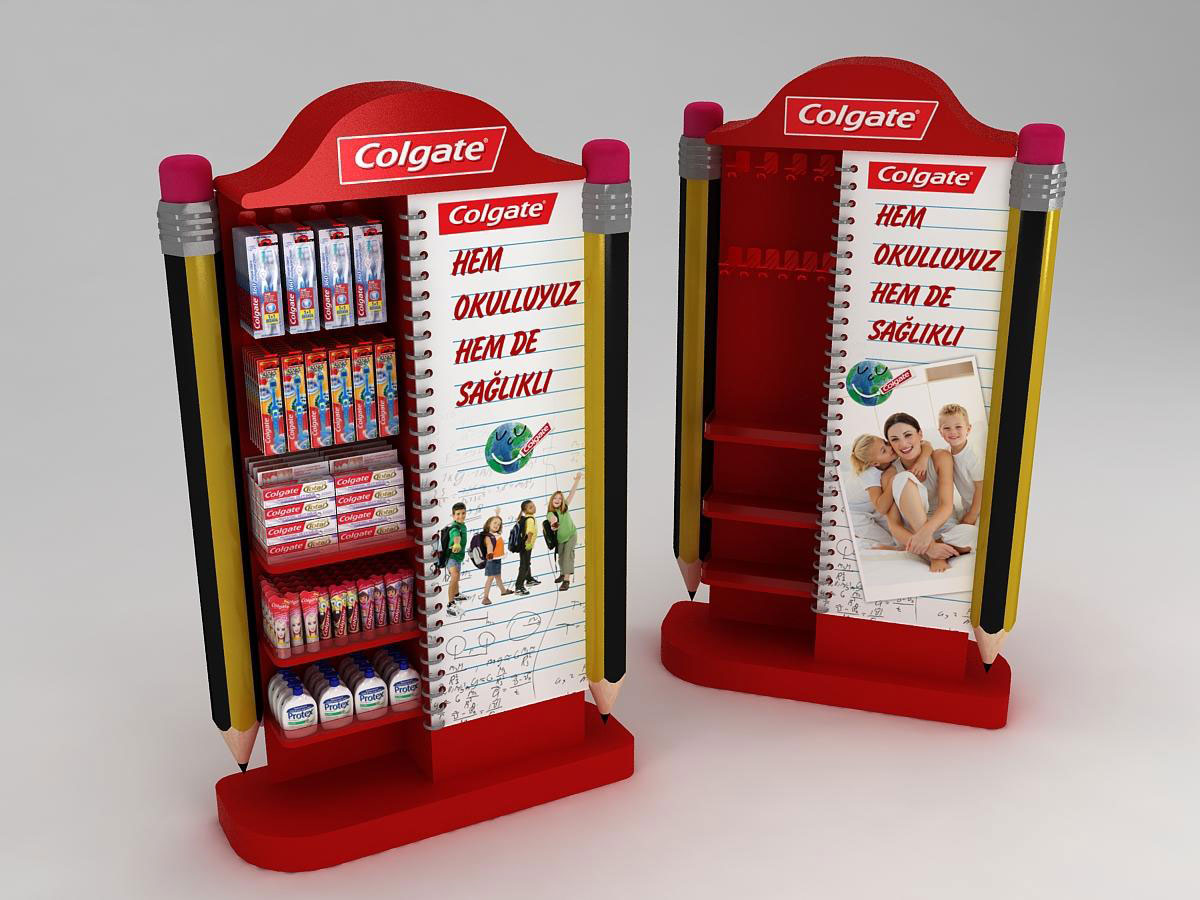
Case in point: toothpaste brand Colgate sells the idea of keeping healthy for a bright return to the rhythm of school. Good oral care is key to a positive start every morning. Everyone needs to brush their teeth in the morning, but they’d want to get those pearly whites in tip-top shape – both for kids and parents alike who get up all the same during school days.
Colgate pencil theme (Source: Behance)
5. Larger Than Life
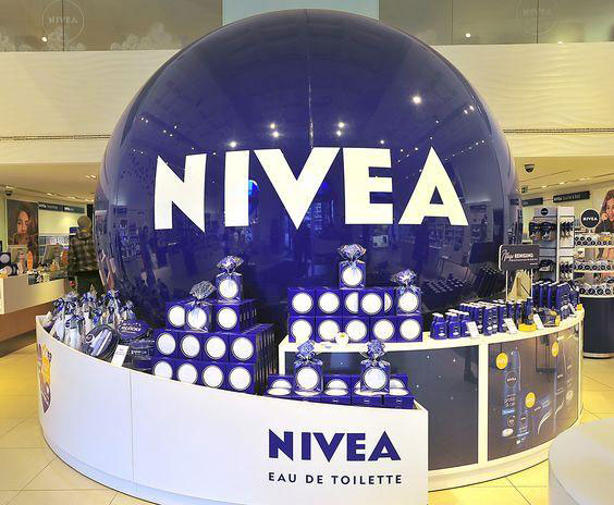
At times the theme of a campaign is as simple as going big. Straightforward and clean with no frills, but huge. That’s what Nivea did to promote its Eau De Toilette.
The giant blue ball with an encircling countertop display demonstrates nothing but the brand name in order to get eyeballs from shoppers, and that’s enough.
Nivea goes big for its EDT display (Source: Pinterest)
This means that sometimes you’d just need to build a massive display that’s virtually impossible to ignore. Then let your product do the rest of the talking.
6. Shape Of Festivities
Festivities are typically accompanied by special themes and visual motifs that are inherently understood by shoppers within the context of those celebrations.
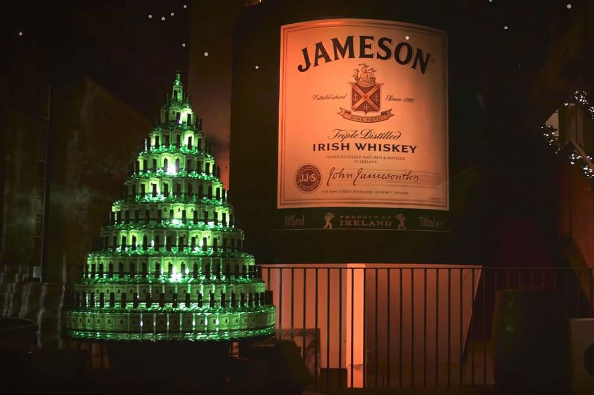
Chinese Lunar New Year comes in red and can be represented by lanterns, Chinese gold bars as well as the zodiac sign for the year. Diwali or Deepavali comes with oil lamps and intricate rangoli designs. Christmas is celebrated across all retail settings with some form of Christmas tree and perhaps Santa Claus.
Jameson whiskey Christmas tree (Source: New Jersey 101.5)
Capturing the unique shape of each festivity doesn’t need to cost much, and in most cases don’t require much ingenuity – just some aesthetic sensibilities topped with a clever touch to showcase a little brand personality.
The power of strong visual representation
One glance can be all it takes to sell an idea (and therefore a product) to shoppers. Whether you’re associating your product and/or service to a nice beach holiday, a festive cheer, or a new movie release, smart thematic POSM designs can help you create a strong impression. The best part is that it can be budget-friendly too!

