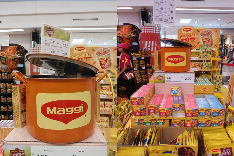
Retailers are always looking for ways to stand out from the competition. One of the best ways is by investing in visual merchandising. More than just helpful product arrangements, it is an art form that can help retailers to sell more products and boost profits.
In this post, we’ll cover 5 tips that will help you improve your retail space with effective and engaging visual merchandising.
1. Use clear window displays to capture shoppers
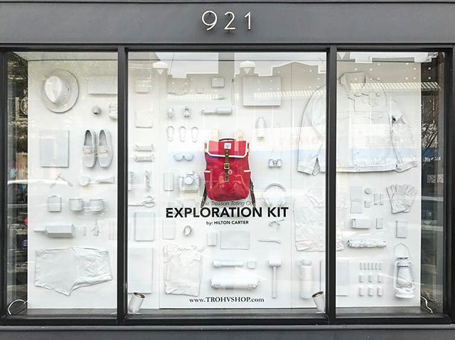
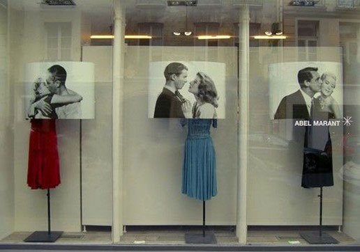
In the retail world, window displays are crucial in a marketer’s arsenal for making an impact with window shoppers.
They allow stores to make a strong first impression to those who are just looking around, and pique their interest with compelling promotions, captivating messages and creative storytelling.
Window displays serve as a ‘landing page’ for shoppers, luring them into the store to see what else is available. For retail marketers, there are some important considerations for window displays:
- Employ visual storytelling through creative product arrangement and copywriting
- Tailor your window display according to your target market for that location
- Focus on one clear message. Don’t fit more than one message into your display
- Use it as an opportunity to highlight what makes your brand unique and different
Source: Pinterest
Source: Pinterest
2. Pay attention to what shoppers are actually seeing from their point of view
This seems like a very obvious point, but it goes a long way to understand how shoppers perceive how you set up your store visually. Because they see your retail setup through the lens of their wants and needs.
For example:
- Are your products placed at eye level of your target customers? Footwear retailers often display their goods against the wall rather than on tables—they’re easier to browse as it’s easier to group them by use too.
- Do they want to touch, hold and use your product to consider it? Personal electronics retailers like Apple and Samsung do this well for their devices.
- Can shoppers imagine your products in their home or workspace? IKEA is good at illustrating products within mini mock setups of bedrooms, washrooms, kitchens, play and work areas in their store.
Source: Pinterest
3. Make shopping easier. Minimize clutter and group related products.
When retailers make shopping easy for shoppers, it’s easier to convert them into customers. One way of doing so is by eliminating clutter, and grouping related products together on a shelf or in an aisle. Besides that, provide ample white space for ease on the eyes and to free up more walking space.
This will help ensure that the customer can find what they are looking for quickly, which saves them time (and headaches).
Take it a step further and ensure speedy service with a good inventory tracking system. Products that aren’t on display can be retrieved with ease. If something is out of stock, they’d know in an instant; no rummaging through storage while leaving shoppers waiting.
4. Add some spark with focal points and contrast
Visual balance is good for any brand’s retail store. It is designed according to the color palette, lighting and materials that best represent the brand.
But it’s good to also break that balance in order to bring attention to seasonal or flagship products. You can do this by using bold colors, wall text, lighting and strategically placed signages to draw eyes to a specific section of your store.
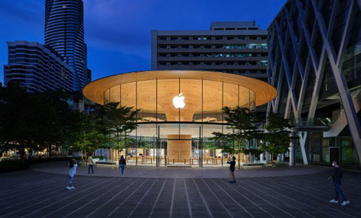
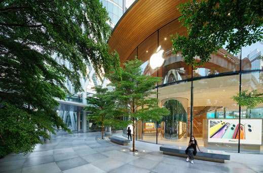
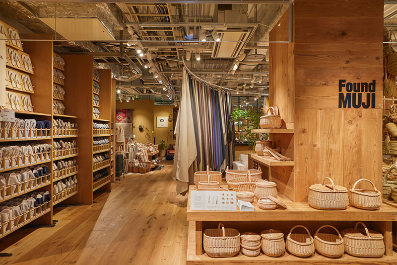
Not every store needs heavy contrasts. Sometimes having different materials can lend your store more personality. Consider how Apple designs its retail outlets: they are typically replete with ample bright white spaces and beautiful digital displays that match their products.
However, their use of bamboo wood tables and shelves add a touch of nature that breathe some vitality into their minimalist setup. This theme is taken to the edge and amplified for their recent flagship store in Thailand as trees surround a stunning central wood canopy.
Source: World Architecture
5. Find opportunities to be tech-forward and social
There are ways to use innovative tech for pragmatism rather than for the sake of having a gimmick.
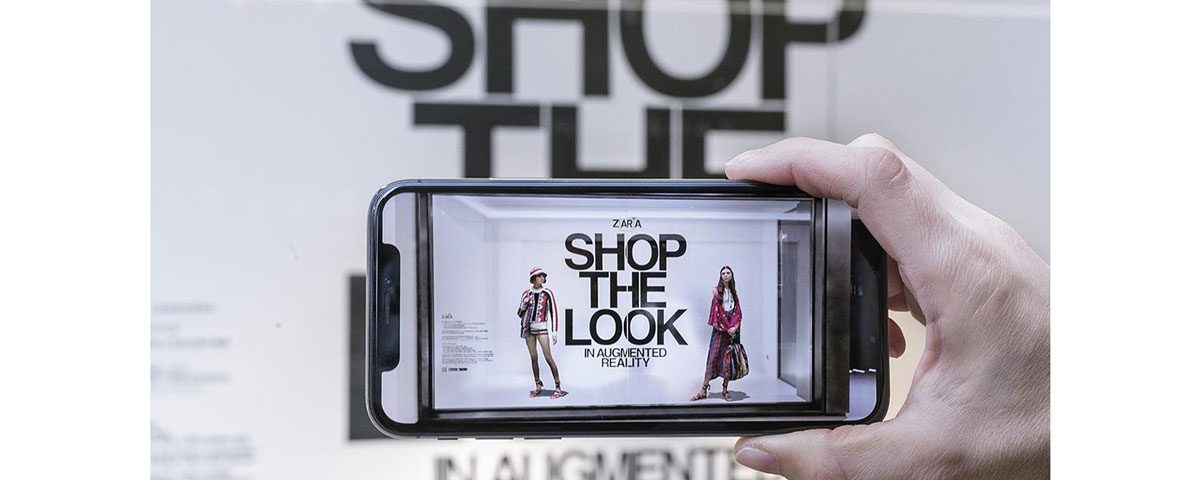
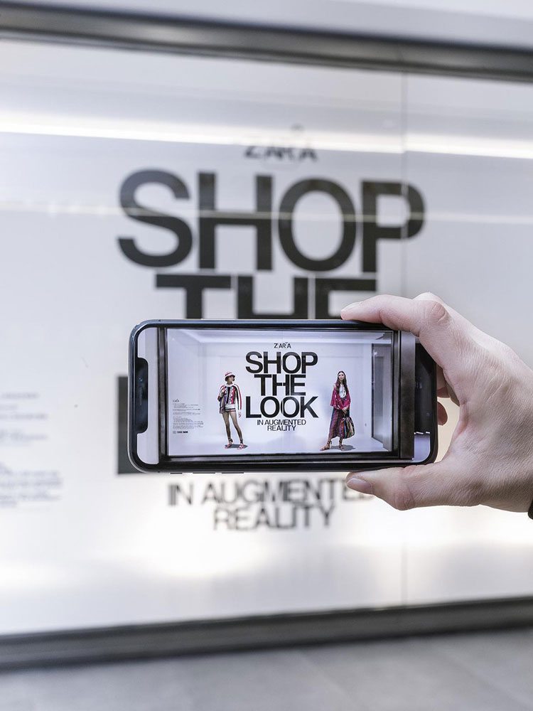
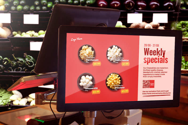
For instance, using augmented reality (AR) QR codes for a contactless and space-saving way to view merchandise. Or using analytics from data captured by digital window displays to ensure that the right ads are played to the right crowds based on store location.
Another question to ask would be if your store is social media friendly. Would customers want to share selfies of themselves being there? Is there a display, crowd (queue) or mood that people would want to capture and share?
By making your retail store shareable, you’ll be getting eyeballs from more than window shoppers.
Source: Dexigner
Visual merchandising that brings value to shoppers
Modern retail is not only about stand-out displays and impressive layouts. Brands have to make it easy for shoppers to find what they want. Storytelling and strong brand experiences also help to engage shoppers, especially in a time when spatial interactions are becoming more important than ever.
These simple and effective tips will help you create a visual merchandising plan that’s sure to stand out for shoppers. What are your favorite visual merchandising tricks?

