The great news about point-of-sale materials (POSM) set up during Chinese New Year is that they almost always come in eye-catching colors of red, gold, and all shades in between.
With that palette on hand, many brands have their own ways of showing up during festive seasons. And POSM displays are the perfect means to express who they are as a brand while capturing the spirit of the season.
Here are 4 POSM ideas that demonstrate how brands can create a Chinese New Year retail display that is both simple yet distinctive.
1. Making it sexy: Giorgio Armani
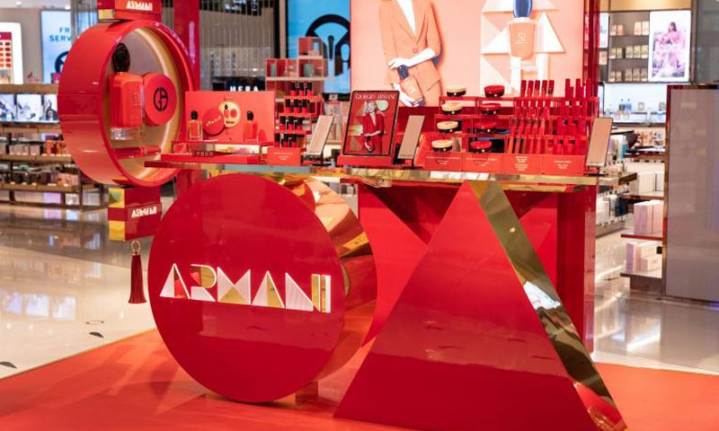
Red is the colour of passion, so why not tap into that for Chinese New Year? Rather than vibrant and whimsical pops of red, go the sexier route.
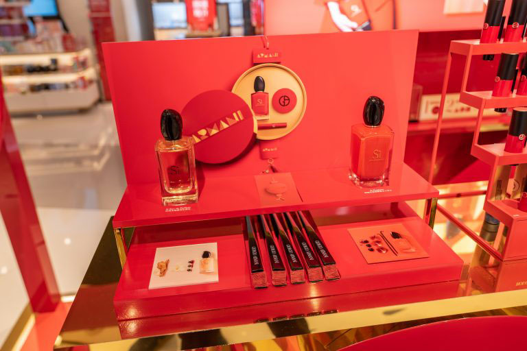
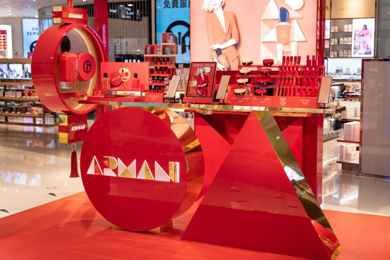
Case in point: The deep, passionate and sultry shades of red with trims of gold run through the Giorgio Armani pop-up booths. It makes for an imposing presence among other standard and more muted displays.
Source: DFNI Online
Source: DFNI Online
Based in Hong Kong in 2019, this display came about through collaboration with DFS. It consisted of several Giorgio Armani’s products adapted to red for the festive season, with make-up consultants and limited edition products to boot.
2. Winning with copy: Le Clos
Sometimes, too much colour can be overpowering and off-putting, especially in different contexts where too much red or yellow would stick out like a sore thumb. In Dubai Airport, fine wine and luxury spirits seller Le Clos toned down on colours and more with simple, straightforward copy.
Not only does the display let on clearly that there are up to 35% savings to be enjoyed, a square archway runs perpendicular to the display to catch walkers who would otherwise walk past the display without noticing it.
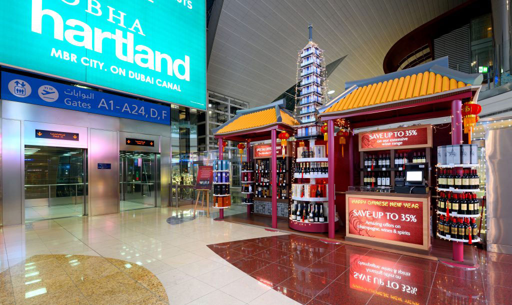
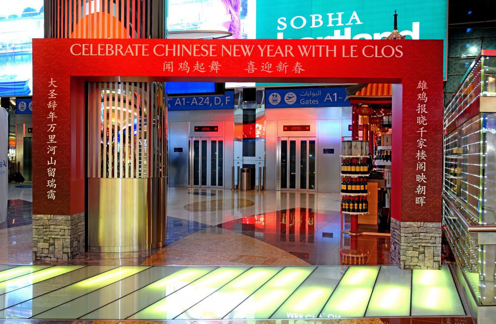
In any case, passers-by would still be able to tell it’s a pop-up display for Chinese New Year due to its oriental yellow roof tiles and a 4.5 meter tall pagoda festooned with festive lights, not unlike a Christmas tree.
3. Stripped down classy: TOUS Jewelry
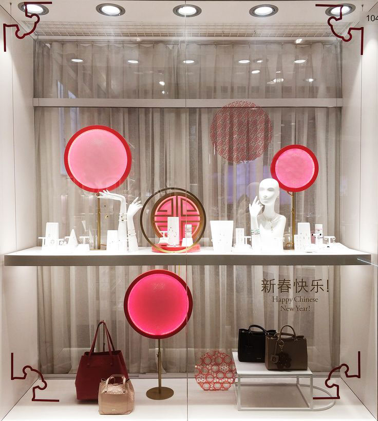
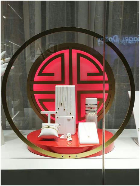
Sometimes even less is more. For brands that are known to be visually subdued and classic in appearance, the products are the star of the show and need to be the focal point of displays.
This is the case for jewelry brand TOUS, which stayed close to its classy minimal style by opting for a subtle Chinese New Year window display. As soft shades of red and pink welcome the season, framed with appropriately non-descript window decals, the products remain at the center of attention.
Source: Pinterest
Source: Pinterest
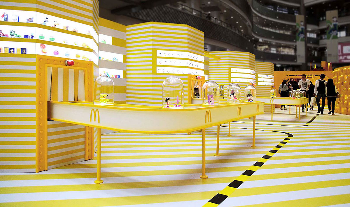
4. Double down on yellow: McDonald’s Happy Factory
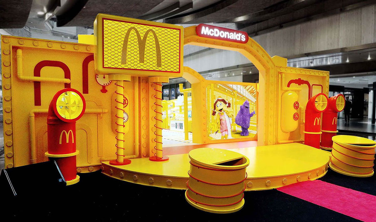
Although McDonald’s Happy Factory was set up to commemorate the fast food giant’s 25th anniversary in China, it showcased the perfect alternative Chinese New Year look: inverting the color emphasis from red to yellow.
The immense retail pop-up, used to showcase a ‘factory’ of famous toys from around the globe, was replete with the bright color of prosperity and oriental royalty. Add the right Chinese New Year ornaments and it could easily be the perfect POSM display to usher in the festive season.
Source: Behance
Source: Behance
Source: Pinterest
Source: Pinterest
Red may not be flattering for all brands, and it could pose a challenge to some when it comes to embracing creativity during Chinese New Year. But there’s a good case to be made for yellow as a primary color, not to mention the likes of pink or even burgundy.
Putting the prosperity in POSM
From lush and vivid setups to more understated approaches, there are many ways to go about creating POSM displays that appeal to shoppers during Chinese New Year.
As shown from the aforementioned examples, brands have shown that there will always be room for various forms of creativity. How could your brand express the festive colours through POSM displays to woo shoppers during the Lunar New Year?

